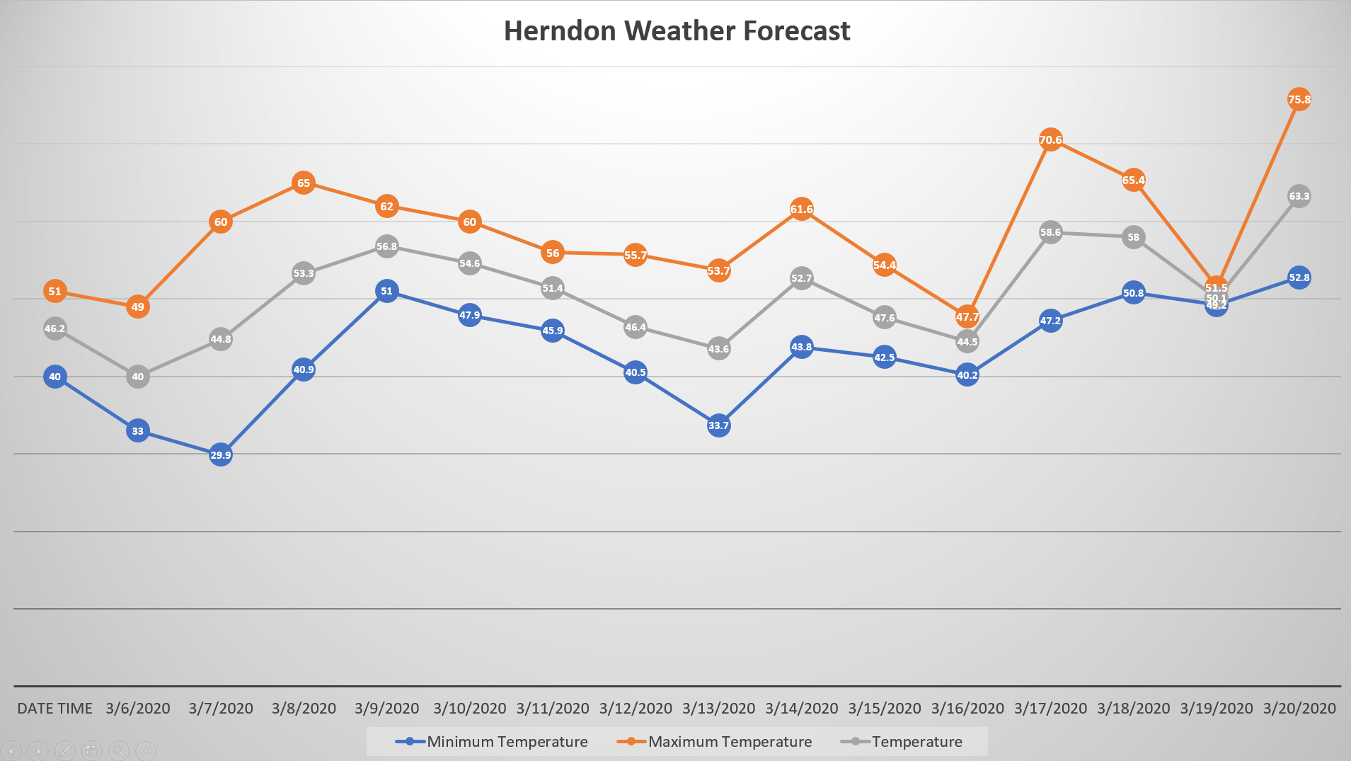
We are going to walk you through building a PowerPoint that has a graph of your current forecast. We will utilize the ability to pull Visual Crossing Weather Data directly into your PowerPoints and have them update the forecast everytime you open it.
Weather data provider
We are going to use a number of techniques to include the weather data into our Microsoft PowerPoint. The technique we are focusing on is inserting a live web query link into a PowerPoint Slideshow so the weather forecast can update automatically. Before we can start including the weather data into our slides, we need a provider that will provide the weather data in a format suitable for Microsoft PowerPoint. For that we will be using Visual Crossing Weather Data as the weather data services product allows for easily viewing, downloading and web query access to both historical weather data and live weather forecast data.
If you don’t have an account, you can simply sign up for a free trial for Weather Data Services. For help on getting started with the Weather Data Services page, see Getting Started With Weather Data Service.
Now we have an easy way to find weather data, we will open a blank PowerPoint Presentation.
Creating Our Basic Graph
After you open your blank presentation, you can delete the default slide contents or create a new slide such that is doesn’t have any content on the slide. Next, from the ‘Insert’ menu choose the ‘Chart’ icon which will open a window from which you will select the ‘Line’ chart type, then choose the ‘Line with Markers’ icon. Finally we will click ‘OK’ at the bottom of our page.
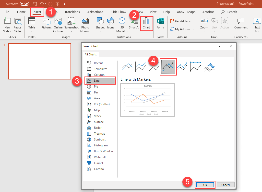
We now have our first chart:

The first thing you may notice is that an embedded Excel workbook named ‘Chart in Microsoft Powerpoint’ is associated with our chart and will contain all of the data you need to create your graph. However the initial version of editing in Excel is too basic for our needs. To open the full Excel editor simply click on the ‘OpenInExcel’ button at the top of the Excel workbook.
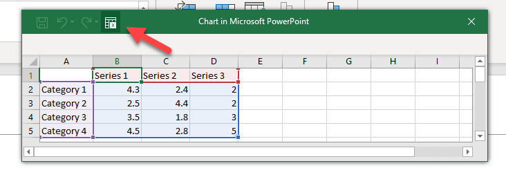
You will notice that a full instance of Excel will open with the chart data in ‘Sheet 1’. You can Delete this sheet later after we load our weather data.
Next we will work on loading in weather data. To do this click on the ‘Data’ tab in Excel, Choose the ‘From Web’ icon and Excel will open an entry box for you to enter a Web Query URL.
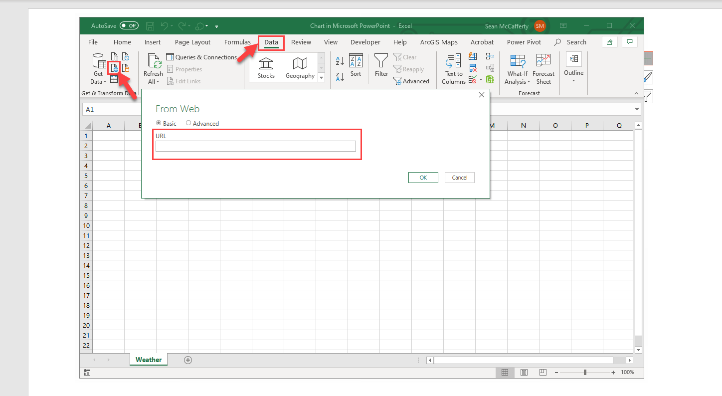
At this point we will take a slight detour from PowerPoint and Excel so that we can get a URL to fetch our weather data. To do this we will use the Visual Crossing Weather Data Service by visiting the weather data service page:
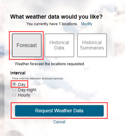
On this page you can login with your account or sign up for a trial. Once you are logged in, the page will request that you add a location for the weather query. We choose ‘Add Manual’ and enter in Herndon, VA as our weather location. Next we will choose the ‘Forecast’ option and we will choose the ‘Day’ interval to get daily forecast data and then we will submit our query by clicking on the ‘Request Weather Data’ button.
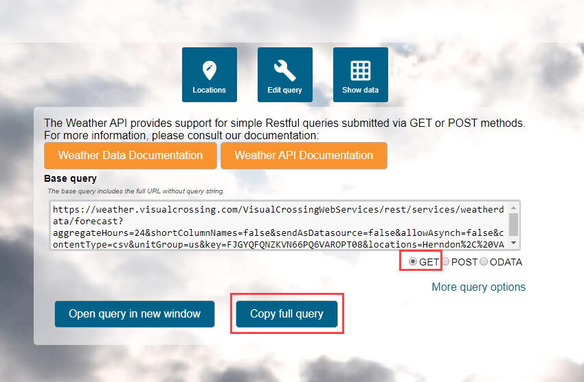
You should now see a 15-day forecast view for your location. Next we need to click on the ‘Query API’ button at the top of your forecast page where we can copy our URL that represents the query we just built. Click on the ‘Copy full query’ button to put the URL into your Copy/Paste buffer.
Now that we have our URL String copied we can paste in the string into our Excel window that requested a URL string to fetch our weather data as shown above. Click ‘OK’ and then click ‘Load’ to finish the query loading process. NOTE: You may be asked about security warnings as well as the fact that formulas and references have changed. This is normal and you can click through these to see the result of your query. We can now rename our new sheet ‘Weather’ or something appropriate and delete our previous default sheet that PowerPoint provided.

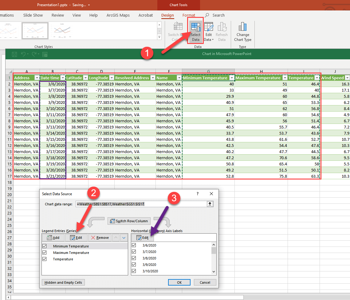
The final step in connecting the chart to our weather data is to change the chart series definitions. We do this by clicking on the ‘Select Data’ button on the Ribbon Bar while our chart is selected. This will open an editor that allows us to define both Axis series. First choose ‘Edit’ for the ‘Legend Entries Series’ and then select the table data from Address through temperature as seen by the red box below. Then choose ‘Edit’ for the ‘Horizontal Axis Label’ and choose the dates in column B called ‘DateTime’.(don’t choose the date column header as we only need the dates. This selection is highlighted by the purple box below. You should see the following:
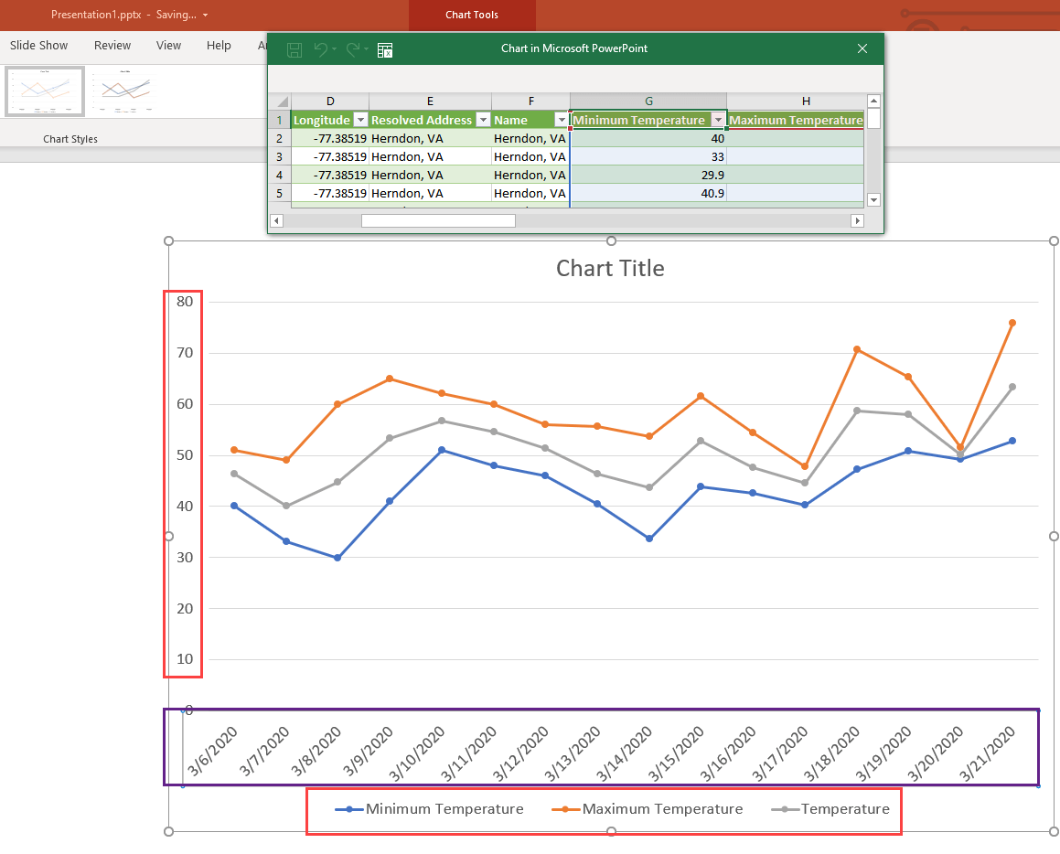
After clicking ‘OK’ you should now see the following chart results with Temperature on the Y-axis with 3 series of Temperature data (Min, Max, Temperature) with our forecast dates on the X-axis.
Now we just need to format and save our PowerPoint
Basic Chart Formatting
First we will change our Chart Title to ‘Herndon Weather Forecast’. Next, to keep this exercise simple we will use a predefined style for our chart by using the ‘Chart Styles’ button to the right of the chart. Here we will choose a pre-formatted style that appeals to us, maximize the chart to match the slide and then adjust any fonts as necessary. Here is our result:
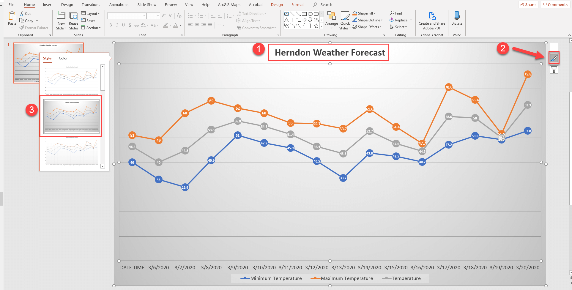
We now have an attractive chart of forecast weather data being loaded live into our PowerPoint Presentation! Very powerful and it only took a few minutes to create. Finally we will make sure the query updates dynamically.
Refreshing your Query Data
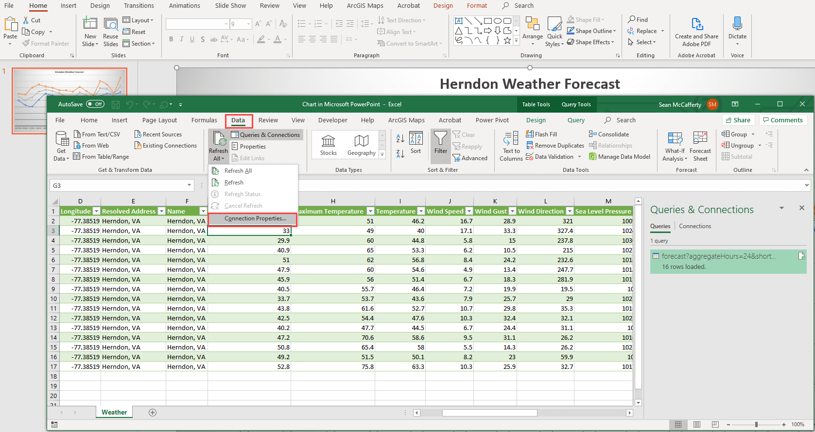
There are many ways to trigger updates to our query data. Users can manually refresh on the data, your can code in buttons to refresh the data or you can set up an auto refresh policy. For this example we will choose the latter. To do this, we right-click on the chart and choose ‘Edit Data’. As we did before we will open the full Excel editor. Once opened in Excel, you should see your weather data as before. Now choose the ‘Data’ menu and ‘Connection Properties…’. In this menu, you can select the refresh policy that is your preferred style. We have chosen to refresh the data on opening of the docuement. Everytime this Presentation is opened, the latest forecast data will be fetched.
Finished!
